Academia is an online platform that allows scholars to share papers with millions of people across the world for free. Its premium feature allows users to track the impact of their work by collating data on papers that mention their work. It also allows optimized searches that gather packages of relevant scholarship to be dowloaded effortlessly.
Academia requested a consultant proposal to redesign their Premium call to action page to increase conversion rate for paid subscribers.
Competitive Analysis
For a competitive analysis, I reviewed a number of organizations and I chose ResearchGate, Scribd, JSTOR and TED. ResearchGate is a true peer, offering academic networking and author metrics and focuses its marketing on B2B with potential advertisers. I also included Scribd since it is subscription-based, they market to individual users, and it has an extensive library of academic papers. And since Academia is moving into the audio content space, it’s important to look at what Scribd is doing there as well. I included JSTOR as a platform that markets subscriptions to institutions, as a peer that integrates its research content into its design in an interesting way, and lastly I chose TED because it is membership based and sits successfully between entertainment and the academic world, making it a major influence on Academia’s target audience, since it is a showcase for academic celebrity.
ResearchGate uses two different illustration systems that read as approachable and organized, while also demonstrating concepts well. On the left, we see this system that uses a semi-flat style that feels very specific to the tech world. There are really graphic, sharp feeling shadows to add a layer of depth. The icons are grouped with a gray circle, and they break the edge just barely which is quite elegant.
On the right we see another illustration style that uses some of the same colors but introduces this saffron color. The style is different though, you see they’ve departed from the sharp shadows on the left, this illustration feels very whimsical and playful, and it’s meant to show information as these building blocks that are getting arranged or vaccumed up. It makes the work of research look manageable and gratifying using the tool.
These two systems work well independently but they are not cohesive enough to work together. If I were going to consult with them I would recommend tying the two systems together by using similar shadows and either the same palette throughout or scale back one system to only use one or two colors so they don’t compete as much.
They use lifestyle photos sparingly and well, but they’re not very conscious of the color used in the photographs, so the photos do detract from the color used on the rest of the website.
Scribd solves for the issue of color in lifestyle photography by using color overlays like this image of the camera, and by being really thoughtful about the photos they’re choosing like matching the black in the photo on the left to the background color. This really allows the design to sing, by pulling back on the color variations it allows the one color pop of the button to stand out.
The types of photos they choose is important too, as you can see the color schemes feel cohesive and personal, and very natural and not stock photo feeling.
Their use of icons is extremely restrained, they keep the graphics minimal which again allows the focus to be pulled elsewhere. They don’t compete against the more visual graphics even though they clearly communicate what they need to.
JSTOR pulls header backgrounds directly from its archives, which is a very elegant solution. They were even able to find images for the banners that all work in the same palette with each other. This is super successful because it creates visual excitement to explore what is in the collection. Also noteworthy is JSTOR’s iconic monogram logo, which is timeless and beautiful, and offers a different approach than the more tech feeling aesthetics on some of the other sites we reviewed.
TED uses a single color really effectively, that red is recognizable but for such a dominant color it does balance well with the rest of the secondary jewel tone palette. They use these photomontage graphics to show speakers in a way that feels cohesive and animated and almost feels like a movie poster. This definitely plays into the aspirational marketing, the membership CTA proposes that you’re joining a sort of club, and that by doing so you’ll become adjacent to this type of academic notoriety and celebrity. These hand drawn illustrations do a nice job of feeling very nonprofit and contemporary. They feel a bit childlike, in that they emphasize curiosity and possibility, almost referencing Reading Rainbow. It’s never a bad thing to appeal to a user’s inner child, as long as it’s balanced with a legitimate product that feels polished. Because they use a single illustration style and use it sparingly, it works really well.
Opportunities
Illustration communicates concepts and sets the tone and feeling of the brand. When it’s successful, it simplifies information clearly. When it feels disjointed, it can distract from flow of information and decrease legitimacy.
Regarding palette, ResearchGate and Scribd use very similar brand colors. These colors feel corporate and might not appeal to younger audiences. The hues of these colors are varied but the shade feels consistent. Because of this, the colors feel muted without feeling soothing. The palette should feel exciting but reassuring since this is a tool they are using to reduce the stress of research. They need to see the product as calming.
An advantage is that Academia’s brand blue is very soothing while being bright enough to capture visual interest. This can be elevated with additional color pops and use of gradients.
I also think there’s an opportunity to use some well placed lifestyle photography to help users envision themselves succeeding by using Premium. Of course Academia needs to make a strong case for its value proposition, but it also needs to resonate with users on an emotional level and sell an optimized lifestyle, and photography can certainly help there. Adding color overlays and gradients can help make photography more cohesive and visually interesting.
Opportunites: Current Page
The Premium button stands out well in the hierarchy, since that blue is really eye catching and feels powerful. I would recommend revisiting the gold color here, since it feels very neutral and a bit financial or conservative. This is an opportunity to energize the page with a more vibrant and soothing color. It’s possible to reduce the number of items here to four, so that the information is easier to digest. I would overall try to make this page more visual to increase click-through. I think the title messaging is really resonant, and I like that it’s very distinct in the hierarchy of the page.
Direction One
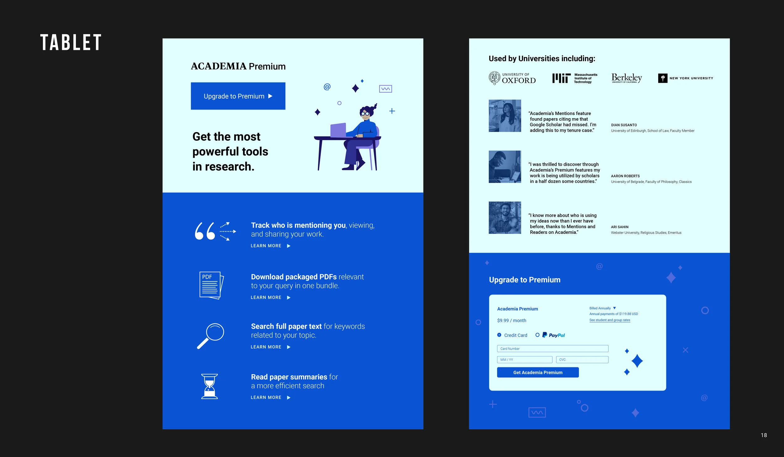
This direction uses an illustration system that feels playful and aspirational but also stylish, and uses a line art style for icons. The illustration on the left shows a relatable user who is in a flow state, using Premium, picking up her mentions, tracking metrics of her impact, adding relevant papers to her bibliography using PDF packages, working efficiently and feeling the magic. I’ve reduced the number of icons here to allow for easier intake of information, and tweaked some of the copy to be more user facing and understandable for someone who’s looking at it for the first time. You’ll see that these items each have a “learn more” prompt at the bottom, which would push the content down to open a window with more information about that item. By having this, Academia can also track what is clicked on to gain additional insights into buyer motivations.
Clicking on the Upgrade to Premium will take you to the purchase interface, which I believe should be stacked below in its own space, because it’s important to reduce distractions when users are making a purchase. Bringing in testimonials at this point adds the final push of credibility to enter payment info.
Direction 2
Direction 2 uses an expanded color palette, more geometric and minimal graphics, and gradient and color overlays to emphasize lifestyle photography more intently. By showing testimonials higher in the hierarchy of this page, we are supposing that users would relate to the experiences and would be motivated by the vision of an optimized life created by using Premium. The features information is still clearly shown, but the icons are simpler to pull focus where we want, in this case the testimonials.
The color pops for each testimonial photo moves the eye to each one at a time, so they are all emphasized but do not compete or become uniform. The gradient at the top is also a simple way to guide focus from left to right, and the eye naturally follows it from the header over to the upgrade button.
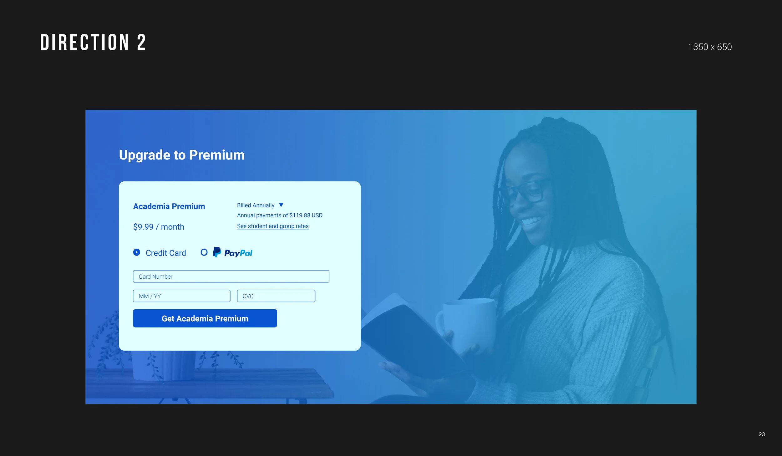
The payment window also uses a gradient over lifestyle photography, keeping the layout clean but energizing to allow the payment to be the primary focus.
Testing
In testing color we want to learn what’s more effective: a scaled back palette that lets icons and illustration do the heavy lifting or a more varied palette that highlights lifestyle photography, using simpler graphics.
The second test we’re looking at here is product features versus aspirational storytelling. We want to know: do users connect more with marketing that shows the desired outcome of a life made simple by Premium, or do they want to see engaging visualizations about the product features?
For the payment portal, we are also testing what background builds trust and guides attention toward completing the payment. On one option we have a subtle illustration, and on the other, a photo with a gradient.
Efficacy can be tracked by click through rates, time spent on a page, and for the latter question, the rate at which people enter their credit card info and sign up for Premium.

